How effective is the combination of your main product and ancillary texts?
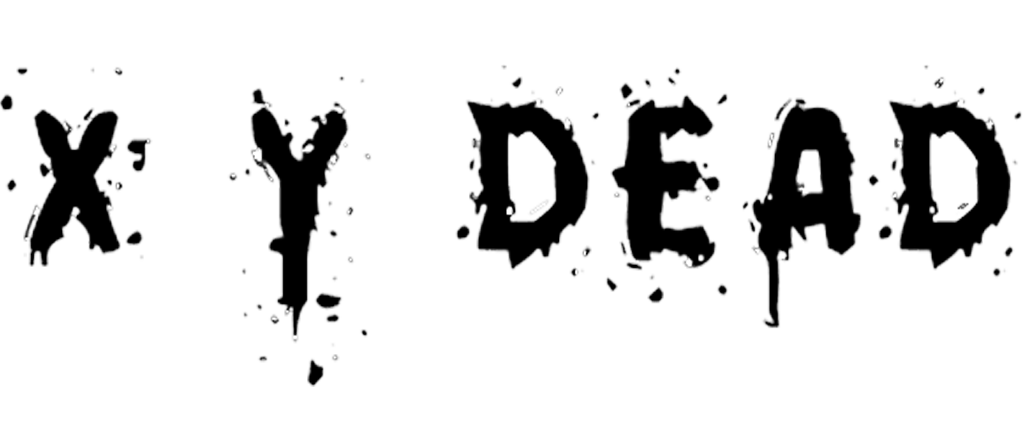
As part of our promotional package for the fictitious film ‘X Y DEAD’
we created a website and movie poster. In order to make the texts
relate to one another effectively we followed the same themes in the
ancillary tasks as in the trailer.
Throughout the package we have used the same title, the red writing
resembles blood splattering and dripping which translates well from the
zombie horror genre. This is used in the trailer, poster and
front page of the website and creates a clear combination between them. The use of the same title is found in most promotional film packages,
for example, Django Unchained, a recently released film from Quentin
Tarentino film. In the poster, trailer and website the title is
the same, in this case they have also used the logo of the chain which
appears in each item of the package.
Though our package
doesn’t use a clear logo in it, the zombie in the poster features many
times in our trailer, so it is the most recognisable image. Especially because of it's eyes with only the small pupils. This is why we chose to have this zombie for the
poster rather than any other.
The eyes of this zombie is an image shown in the automatic slideshow on our website. The image is made more powerful by the vacant expression of the zombie, mixed with the blood on the face, and the treatening eyes, an effect made by iris-less contact lense. The empty eyes are a feature found many times throughout the package, as in the film
they are the most recognisable feature that distinguishes the zombies from the humans.
In our trailer we used a colour
filter to make the shots more eerie and so to build a mid-apocalyptic feeling. This was done by increasing the exposure and contrast as well as enhancing the blues. We also did this for our poster so that the same effect is achieved when looking at the poster as watching the trailer.
In the poster the reds have also been intensified to bring out the
blood on the zombie. By doing this the blood becomes the same colour as
the title further tying the trailer and ancillary texts together. This
deep red colour represents blood and so is present throughout the whole package.
The colour scheme of the website is black and deep red as it is on the title
on the trailer. This colour clearly represents the
zombie genre and highlights the huge amount of blood and gore associated
with it.
Shown together it is clear that the trailer, poster
and website relate to each other strongly and work together to create a
desirable film package.
No comments:
Post a Comment